Friday, November 19, 2010

Finally! A practical R book on Data Mining: "Data Mining With R, Learning with Case Studies," by Luis Torgo

I've been a bit busy lately with a few big things, however, I wanted to stop by and mention a fantastic book for those who have been following along the R examples.  Anyone who's followed my blog knows that I'm big on practical books with examples.  There are also three main open source tools I've discussed with regards to prototyping trading systems: Weka, Python, and R. Of the three tools mentioned, I've been able to recommend Witten and Frank's book on Data Mining for Weka, and Stephen Marsland's book on Machine Learning as the Python bible for hands on Machine Learning.  Well now, I can thankfully complete the trinity, with Luis Torgo's new book, 'Data Mining with R, Learning with Case Studies.'

Both R novices and experts will find this a great reference for  Data Mining.  The opening chapter has a useful intro to get you started on R (Factors, Vectors, and Data Frames, as well as other useful objects are covered with examples).  Additional chapters cover both classification and regression type prediction schemes.

The most useful chapter to readers here, however, is the chapter on 'Predicting Stock Market Returns.'  Many of the readers who have been looking for example scripts on some of the topics I've covered, will find them here. Not only is gathering and processing data (CSV,  quantmod and yahoo finance, and MySQL) well covered, but various prediction and evaluation schemes (cross validation, sliding and growing windows, PerformanceAnalytics package) are discussed along with access to the author's code.  Many topics I haven't discussed yet are available here as well, including MARS (Multivariate Adaptive Regression Splines), SVMs, and various validation techniques along with handy tabulation of results.  Having read a previous draft, I'm still working into the examples, and welcome any feedback and thoughts I can address.

The book can be accessed via the amazon book showcase on the right and instructions for R code access are available in the book.

Tuesday, August 10, 2010

Conditioning Systems on Regime Variables

Here is a brief and simple example of switching systems based upon regime type (sometimes called gating).

I've brought up the idea of conditioning systems based upon regimes many times in past posts. Some texts call this filtering, although I prefer to use the term conditional gating. The simple idea is to turn on a certain system during certain conditions and either: switching systems, or simply tracking the underlying series during alternate conditions. In this case the gating condition is regime, which in turn is, is High or Low Volatility as measured by the VIX.  Although I'm not divulging the details of the underlying system itself, I've seen enough discussions in public domain to feel that other traders have picked up on the ideas demonstrated here.


 Fig 1. Terminal Wealth vs. VIX threshold

The animation below shows the system results during each step of the conditioning variable, the VIX. Notice the dramatic improvement at the value of 23. Also, notice as mentioned in earlier posts how the optimal switching point of 23 is the most robust value, since even if the OOS results are to the left or right of the optimal switching point, they will be the best local values over a wide range of dependency. The astute observer might have noticed that this system is simply tracking buy&hold during low vix regimes, while switching on system V, during the high regimes. It is evident that the terminal wealth simply tracks buy & hold after a certain value of VIX, since it is always locked on to tracking mode under a certain threshold.

The system is only shown in sample, however, I've found it to be pretty successful OOS as well.


Video 1. Stepping the Equity Curve system through linear VIX range.

Monday, August 2, 2010

Quantitative Candlestick Pattern Recognition (Part 2 -- What's this Natural Language Processing stuff?)


I wanted to briefly add one more thought regarding the temporal nature of probabilities as was alluded to in my correspondence with Adam, as well as the prior closing comments on the Chaos post (structure coalescing and dispersing).

I will borrow from the field of Natural Language Processing and introduce one common visual description of how the states evolve over time using something called a Lexical Dispersion Plot.


Fig 1. Lexical (cluster state vocabulary) Dispersion Plot of Clustered Candlestick States over time

In studies of language, we are often interested in observing how statistical patterns and relationships of sounds, characters, and words, evolve over time.  Natural Language Processing is an entire field that has been dedicated to finding proper tools and vernacular to describe such statistics.  The idea of using a lexical dispersion plot, is to observe how the lexicon itself evolves over time.  To give a simple example, we might take a corpus of common pop culture texts borrowed from some library, and look at the occurrence of the following three word states; "spider", "man", and "spider man".  The first two terms are isolated words, and the third term is called a bigram, which is a joint occurrence of two states in sequential order. 

Now, although I haven't created the proposed lexical dispersion plot for the above scenario, one could reasonably expect for the number of occurrences of the single words, spider and man, to be relatively frequent and uniform from about 1900 to say 1960, while the joint pair (spider,man), might occur relatively sparsely. However, beyond the 60s, we would notice an increase in the joint pair (spider,man) as the popularity of the fictional character began to grow in popularity in the collective pop consciousness.  We might also expect a large frequency of the bigram to occur with recent popularity in the films. However, it's possible that a few hundred years later, that the joint term and character popularity might just wane and eventually die off, even though the two unimodal terms (spider and man) are still frequently observed.

Ok, so what's the point to this? Well, we are commonly taught in statistics that there is a population that exists to describe the ultimate best statistical model of any observational set that lies somewhat beyond the notion of time (much like Plato's ideas of forms existing behind the scenes to describe all nature over all time, for philosophy fans).

But one of the things that disturbed me earlier on is exactly what I described in the prior paragraph on the joint bigram of spider man, which is that sometimes we have to pragmatically shed some of our beliefs about 'ideal' populations and just try to observe statistical phenomena as it occurs temporally.  As mentioned in the Chaos quote, some patterns just spontaneously occur (spider man) for a while, then disappear over time. So, that the notion of a larger population existing behind the scenes (and all the statistical rigor associated with it), might be either overkill or even misleading towards our goal of trying to capture the essence of fleeting patterns. From a statistical viewpoint, I suppose I would lean more on the side of the Bayesian inference camp (constantly updating beliefs online, rather than the frequentist approach).

It's common knowledge in markets that financial time series are not IID (independent and independently distributed) over time. Rather, we accept that there are clusters of regions of behavior that tend to occur frequently together, and likewise, disappear over time (often reappearing again, though not always).  This body of knowledge, specifically related to volatility, is sensibly labeled as heteroscedasticity (differing variance) as opposed to homoscedasticity (constant variance) of observations. We might also notice such behavior being binned and quantified into certain 'regimes' of local stability.

Now, if any of the above meandering made any sense, I will describe how it relates to the Quantitative Candlestick Pattern Recognition article. Recall that using clustering, we were attempting to identify a vocabulary of states that best describe a limited set of features (in the example, six states were identified) that best partition related candlestick symbols by state in an unsupervised manner. However, the dispersion plot in Fig 1. shows that viewed from a perspective of a central population, these states are not uniformly distributed (IID) over time, rather, some tend to occur frequently over relatively long periods of time, while others appear and disappear for reasonable windows of time.  States one and two in the set tend to occur rather frequently, because they are very small moves (dojis and such), which tend to occur often over time. However, some of the larger moves captured in states 3 and 4, tend to persist for some periods, then disappear over other intervals.  The likely explanation, is that larger moves tend to be associated with volatility, which as we know, exhibits heteroscedasticity (clustering together in time). Keep in mind, the dispersion example is not only limited to single symbols over time, but can be extended to any number of n-gram pairs or symbols (such as the two word bigram state for spider man).

With that knowledge in mind, it doesn't always make a whole lot of sense to try to develop and require a central fixed body of pattern statistics and related models over long periods of time, or even require many related statistical tests as neccessary (things like n-fold cross validation over very large time series, bootstrap re-sampling methods with shuffling, and requiring decades of backtesting training data to obtain confidence that we found the best pattern vocabulary to describe data for all time). For instance, in one of the better books on statistics for traders, "Evidence based TA," by Aronson, many of the tests were conducted using t-tests of entire bodies of financial series and rules over a long period of time, while rejecting many potential pockets of temporal success since they were thrown in and bootstrapped with much longer periods of data to draw conclusions about statistical significance of hypotheses related to better than chance success.

This is not to say that common trading statistics should be thrown out; not at all. Instead, it is hopefully to try to look at how the information being evaluated is processed over time (for instance, we may look at long term statistics of trade results, but focus more on short term statistics and modelling of the underlying patterns they are dependent upon).

Additionally, we might be interested in breaking up the pattern information stream into smaller segments and observing and adapting to how the segments of data streams evolve and change over time. The key savior or benefit to us, is that these patterns in the data streams do tend to persist together for quite some time (often reasonably long), before dispersing and moving on to new forms of patterns.  There are several different machine learning concepts on the horizon that work with evolving (such as adding and pruning pattern model parameters) data streams over time and space. I have been spending some time evaluating one of them recently (although, I'm not saying which at the moment) which looks promising.

Tuesday, July 6, 2010

Chaos in the Financial Markets?

Over the years I've had quite a few interested individuals ask me about Chaos and its applications towards trading. Well, as hidden markov models and speech processing were made popular by James Simons and his team at Renaissance Technologies, one could trace much of the popularity of Chaos theory and its financial applications to Norman Packard and Doyne Farmer, two former physicists working in the area of complex systems. Much of their story is discussed in the book, 'the Predictors,' by Thomas Bass. The two were on the forefront of new research in areas of complexity and chaos and had decided to parlay their knowledge into applications towards the financial markets as they founded the company called Prediction Company in Santa Fe, New Mexico. The company was swallowed by UBS systems in 2005.

Fig 1.   2D slice of Lorenz Attractor Phase Space signature A.K.A. The butterfly effect.

We could spend a lot of time discussing various facets of Chaos, as it is a very large field with many different related fields (such as fractals and complexity). But I want to focus on outlining a very simple understanding of why the field seemed so fascinating to traders and quants alike. Most experts in time series run a slew of tests to demonstrate that markets exhibit no predictable order.
However, what makes Chaos so fascinating is that certain time series may seem to pass a battery of common statistical tests for randomness, yet are perfectly deterministic.

Chaos is a field of science that is engaged in studying non-linear dynamical behavior of systems. A popular example might be how different planetary bodies exhibit forces upon one another (see Poincare), or turbulent flow of various particles. Those engaged in studying such systems often like to observe signatures in a domain known as phase space or state space. Rather than look at the time series unfold over time, they are looking for a type of order that underlies the trajectories of the system state dynamics as it unfolds over time. The plot of the trajectory may show structural order that may appear random in the time domain. One of the most popular attractor signatures is the well known Lorenz attractor, which is better known to popular literature as the butterfly effect. Fig 1, displayed earlier, shows a 2d slice of the phase space trajectory, that you can run over at chaos applet. The famous signature displays a fascinating case of underlying order that relates to dynamic atmospheric convection in three dimensions.

A more simple and applicable model that we will look at for illustration purposes, is the well known Logistic Map (also known as quadratic map and Fiegenbaum map). This equation of a non-linear dynamical trajectory was investigated and attributed to Robert May, a biologist studying models of fish populations.

The recursive equation for the Logistic Map is: xnext = r*x(1-x)
Note that this is a feedback system which has some control over the dynamics of the system model by varying the value r. What you'll see if you plot it out vs. the control coefficient, r, is that the series moves from a stable system to one which bifurcates into periodic cycles; and as it approaches the value 4 it starts to behave chaotically. Chaotic behavior is aperiodic, which (like financial series) never repeats exactly; but (unlike financial series) has an underlying deterministic order. In order to see the beauty of chaos and how it exhibits determinism, let's first look at the time series.

Fig 2. Time Series of Logistic Map Equation.

Notice the 1st plot, which shows the 1st differenced time series, shows no signs of periodicity or determinism, nor does the cumulative walk display on the 2nd. However, if we look at the phase space signature of the same series in phase space, we see a completely different picture.

Fig 3. Phase State Plot of Logistic Map

Notice it is clearly deterministic in this figure. I.e. given any point on the x axis, we can easily determine the exact corresponding point one step into the future on the y axis.  This should be fairly obvious, since the equation we started out with xnext=r*x(1-x) = r*x-r*x^2 is a negative parabolic curve. However, many such time series do not have such a simple equation and must be tested in various ways to determine structural chaos. There are other issues to contend with as well, including sensitivity to initial conditions and divergent trajectories due to finite computational precision.

Ok, now that we understand all the hoopla about Chaos and a seemingly random signal having an underlying deterministic signature, what about a common financial time series?

Fig 4. Typical Random Walk (Financial) Time Series.

The Random Walk shows no discernible order, nor periodicity; similar to the logistic equation series. But what about if we observe the phase space trajectory?

Fig 5. Phase Space trajectory of random walk.

No Dice. Notice that the random walk shows zero determinism, hence the gaussian nature.  There are numerous methods to display higher order dimensional metrics as well (correlation lag plots, Lyapunav exponents, etc), and other than something called the compass rose, I've not personally seen much evidence of deterministic chaos in raw financial time series. Incidentally, the phase plot here is equivalent to a lag one scatterplot of returns for those more familiar with finance related statistics.

A last note on the Prediction Company, is that there is an often referenced paper on the mackey-glass equation
(a non linear dynamic model of blood flow) by Meyer and Packard, whereby they used genetic algorithms to find underlying conditional order rule sets for the series. 

I'll end with perhaps the best excerpt from 'the Predictors,' which echoes much of my own focus and discoveries over the last decade...

"One of the fundamental truths about the markets is that the dynamics are nonstationary," Norman explains. "We see no evidence for the existence of an attractor with stable statistical properties. This is what characterizes chaos -- having an attractor with stable statistical properties-- so what we are seeing is not chaos. It is something else. Call it an 'even-stranger-than-strange attractor,' which may not really be an attractor at all.

The market might enter an epoch where some structure coalesces and sits there in a statistically stationary pattern, but then invariably it disappears. You have clouds of structure that coalesce and evaporate, coalesce and evaporate. Prediction Company's job is to find those pieces of structure that have the strongest signal and persist the longest. We want to know when the structure is beginning to emerge or dissolve because, once it begins to dissolve, we want to stop betting on it."

...excerpt from the Predictors, Thomas A. Bass (1999).

Thursday, June 10, 2010

Quantitative Candlestick Pattern Recognition (HMM, Baum Welch, and all that)


Fig 1. Clustering based approach to candlestick Pattern Recognition.

I've been reading a book titled, 'the Quants,' that I'm sure will tantalize many traders with some of the ideas embedded within. Most notably (IMO), the notion that Renaissance's James Simons, hired a battery of cryptographers and speech recognition experts to decipher the code of the markets. Most notable of the hired experts was, leonard Baum, co-developer of the Baum-Welch algorithm; an algorithm used to model hidden markov models. Now while I don't plan to divulge full details of my own work in this area; I do want to give a brief example of some methods to possibly apply with respect to these ideas.

Now most practitioners of classical TA have built up an enormous amount of literature around candlesticks, the japanese symbols used to denote a symbolic formation around open, high, low, and close daily data. The problem as I see it, is that most of the literature that is available only deals with qualitative recognition of patterns, rather than quantitative.

We might want to utilize a more quantitative approach to analyzing the information, as it holds much more potential than single closing price data (i.e. the information in each candle contains four dimensions of information). The question is, how do we do this in a quantitative manner?

One method to recognizing patterns that is well known is the supervised method.  In supervised learning, we feed the learner a correct list of responses to learn and configure itself from; over many iterations, it comes up with the most optimal configuration to minimize errors between the data it learns to identify, and the data we feed as examples.  For instance, we might look at a set of hand-written characters and build a black box to recognize each letter by training via a neural net, support vector machine, or other supervised learning device. However, you probably don't want to spend hours classifying the types of candlesticks by name. Those familiar with candlesticks, might recognize numerous different symbols; shooting star, hammer, doji, etc... Each connotating a unique symbolic harbinger of the future to come. From a quantitative perspective, we might be more interested in understanding the bayesian perspective; I.e. P(upday|hammer)=P(upday,hammer)/P(hammer), for instance.

But how could we learn the corpus of symbols, without the tedious method of identifying each individual symbol by hand? This is a problem that may better be approached by unsupervised learning. In unsupervised learning, we don't need to train a learner; it finds relationships by itself. Typically, the relationships are established as a function of distance between exemplars. Please see the data mining text (Witten/Frank) in my recommended list in order to examine the concepts in more detail.  In this case I am going to train using a very common unsupervised learner called k-means clustering.

 Fig 2. Graph of arbitrary window of QQQQ data

Notice the common time ordered candlestick form of plotting is displayed in Fig 2.  Now using k-means clustering, with a goal of identifying 6 clusters, I tried to automatically learn 6 unique candlestick forms based on H,L,Cl data relative to Open in this example. The idea being that similar candlestick archetypes will tend to cluster by distance.

Fig 3. Candlestick symbols sorted by 6 Clusters

Notice in Figure 3, that we can clearly see the k-means clustering approach automatically recognized large red bodies, green bodies, and even more interestingly, there are a preponderance of hammers that were automatically recognized in cluster number 5.

So given that we have identified a corpus of 6 symbols in our language, of what use might this be? Well, we can take and run a cross tabulation of our symbol states using a program like R.

Fig 4. Cross Tabulation of Clustered States.

One of the things that strikes me right away is that there are an overwhelming number of pairs with state 1s following state 5; Notice the 57% frequency trounces all other dependent states.  Now what is interesting about this? Remember we established that state 5 corresponds to a hammer candlestick? Well, common intuition (at least from my years of reading) expects that a hammer is a turning point that is followed by an up move. Yet, in our table we see it is overwhelmingly followed by state 1, which if you look back, at the sorted by cluster diagram, is a very big red down candlestick. This is completely opposite to what our common body of knowledge and intuition tells us.

In case it might seem unbelievable to fathom, we can resort the data again, this time in original time order, but with clusters identified.


Fig 5.  Visual Inspection of hammer (state5) likely followed by down candle (state 1)

We can go back and resort the data and identify the states via the resorted cluster ID staircase level(5), or use labels to more simply identify the case of hammer(5) and its following symbol. Notice that contrary to common knowledge, our automatic recognition process and tabulated probability matrix, found good corroboration with our visual inspection. In the simple window sample (resized to improve visibility), 4 of the 5 instances of the hammer (state 5) were followed by a big red down candle (state 1). Now one other comment to make is that in case the state 5 is not followed by state 1 (say, we bet on expecting a down move), it has a 14.3% chance of landing in state 6 on the next move, which brings our likelihood of a decent sized down move to 71.4% overall.

We can take these simple quantitative ideas and extend them to MCMC dynamic models, Baum Welch and Viterbi algorithms, and all that sophisticated stuff. Perhaps one day even mimicking the mighty Renaissance itself?  I don't know, but any edge we can add to our arsenal will surely help.

Take some time to read the Quants, if you want a great laymen's view of many related quant approaches.


There may be some bugs in this post, as google just seemed to update their editing platform, and I'm trying to iron out some of the kinks.

Tuesday, May 25, 2010

The Kalman Filter For Financial Time Series

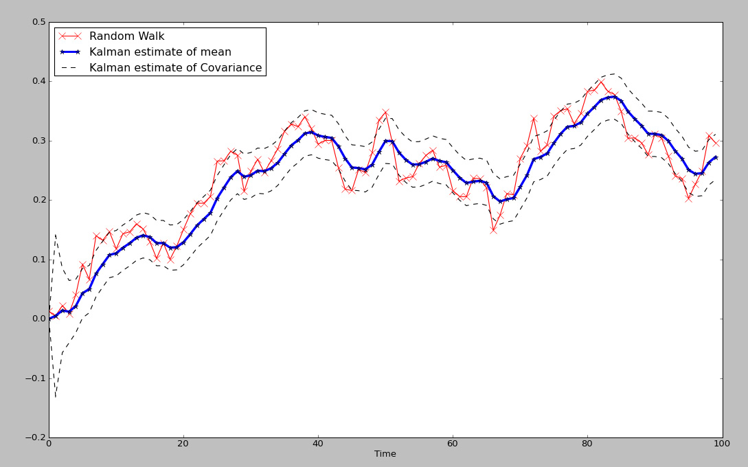
Every now and then I come across a tool that is so bogged down in pages of esoteric mathematical calculations, it becomes difficult to get even a simple grasp of how or why they might be useful. Even worse, you exhaustively search the internet to find a simple picture that might express a thousand equations, but find nothing. The kalman filter is one of those tools. Extremely useful, yet, very difficult to understand conceptually because of the complex mathematical jargon. Below is a simple plot of a kalman filtered version of a random walk (for now, we will use that as an estimate of a financial time series).


Fig 1. Kalman Filter estimates of mean and covariance of Random Walk

The kf is a fantastic example of an adaptive model, more specifically, a dynamic linear model, that is able to adapt to an ever changing environment. Unlike a simple moving average or FIR that has a fixed set of windowing parameters, the kalman filter constantly updates the information to produce adaptive filtering on the fly. Although there are a few TA based adaptive filters, such as Kaufman Adaptive Moving Average and variations of the exponential moving average; neither captures the optimal estimation of the series in the way that the KF does. In the plot in Fig 1. We have a blue line which represents the estimated dynamic 'average' of the underlying time series, where the red line represents the time series itself, and lastly, the dotted lines represent a scaled covariance estimate of the time series against the estimated average. Notice that unlike many other filters, the estimated average is a very good measure of the 'true' moving center of the time series.

Without diving into too much math, the following is the well known 'state space equation' of the kf:
xt=A*xt-1 + w
zt=H*xt + v

Although these equations are often expressed in state space or matrix representation, making them somewhat complicated to the layman, if you are familiar with simple linear regression it might make more sense.
Let's define the variables:
xt is the hidden variable that is estimated, in this case it represents the best estimate of the dynamic mean or dynamic center of the time series
A is the state transition matrix, or I often think of it as similar to the autoregressive coefficient in an AR model; think of it as Beta in a linear regression here.
w is the noise of the model.

So, we can think of the equation of x=Ax-1 + w as being very similar to the basic linear regression model, which it is. The main difference being that the kf constantly updates the estimates at each iteration in an online fashion. Those familiar with control systems might understand it as a feedback mechanism, that adjusts for error. Since we can not actually 'see' the true dynamic center in the future, only estimate it, we think of x as a 'hidden' variable.

The other equation is linked directly to the first.
zt=H*xt+v
zt is the measured noisy state variable that has a probabilistic relationship to x.
xt we recognize as the estimate of the dynamic center of the time series.
v is the noise of the model.

Again, it is a linear model, but this time the equation contains something we can observe: zt is the value of the time series we are trying to capture and model with respect to xt. More specifically, it is an estimate of the covariance, or co-movement between the observed variable, the time series value, and the estimate of the dynamic variable x. You can also think of the scaled envelope it creates as similar to a standard deviation band that predicts the future variance of the signal with respect to x.

Those familiar with hidden markov models, might recognize the concept of hidden and observed state variables displayed here.

Basically, we start out estimating our guess of the the average and covariance of the hidden series based upon measurements of the observable series, which in this case are simply the normal parameters N(mean, std) used to generate the random walk. From there, the linear matrix equations are used to estimate the values of cov x and x, using linear matrix operations. The key is that once an estimate is made, the value of the covariance of x is then checked against the actual observable time series value, y, and a parameter called K is adjusted to update the prior estimates. Each time K is updated, the value of the estimate of x is updated via:
xt_new_est=xt_est + K*(zt - H*x_est). The value of K generally converges to a stable value, when the underlying series is truly gaussian (as seen in fig 1. during the start of the series, it learns). After a few iterations, the optimal value of K is pretty stable, so the model has learned or adapted to the underlying series.

Some advantages to the kalman filter are that is is predictive and adaptive, as it looks forward with an estimate of the covariance and mean of the time series one step into the future and unlike a Neural Network, it does NOT require stationary data.
Those working on the Neural Network tutorials, hopefully see a big advantage here.

It has a very close to smooth representation of the series, while not requiring peeking into the future.

Disadvantages are that the filter model assumes linear dependencies, and is based upon noise terms that are gaussian generated. As we know, financial markets are not exactly gaussian, since they tend to have fat tails more often than we would expect, non-normal higher moments, and the series exhibit heteroskedasticity clustering. Another more advanced filter that addresses these issues is the particle filter, which uses sampling methods to generate the underlying distribution parameters.

--------------------------------------------------------------------------------
Here are some references which may further help in understanding of the kalman filter.
In addition, there is a kalman smoother in the R package, DLM.

http://www.swarthmore.edu/NatSci/echeeve1/Ref/Kalman/ScalarKalman.html

If you are interested in a Python based approach, I highly recommend the following book...Machine Learning An Algorithmic Perspective


Not only is there a fantastic writeup on hidden markov models and kalman filters, but there is real code you can replicate. It is one of the best practical books on Machine Learning I have come across-- period.

Wednesday, May 12, 2010

Is it possible to get a causal smoothed filter ?

Although I haven't been all that much of a fan of moving average based methods, I've observed some discussions and made some attempts to determine if it's possible to get an actual smoothed filter with a causal model. Anyone who's worked on financial time series filters knows that the bane of filtering is getting a smooth response with very low delay. Ironically, one would think that you need a very small moving average length to accomplish a causal filter with decent lag properties; often a sacrifice is made between choosing a large parameter to obtain decent smoothing at the cost of lag.

I put together the following FIR based filter using QQQQ daily data for about 1 year worth of data. It is completely causal and described by .. gasp.. 250 coefficients.

Does it appear smooth? You decide.


Fig 1. FIR 250 tap feed forward filter


Fig 2. 250 weight impulse response determining coefficients

The impulse response is approximately a sinc function, which is the discrete inverse transform for an ideal 'brick wall' low pass filter.

I haven't actually verified much out of sample at the moment, so it's quite possible that the model may not fare as well; it remains to be investigated. However, thought I would share this work to give some ideas about potential of causal filtering methods.

Wednesday, April 28, 2010

Wavelet Spectrogram Non-Stationary Financial Time Series analysis using R (TTR/Quantmod/dPlR) with USDEUR

I've been doing some research lately regarding types of spectral imaging and decomposition techniques that apply to non-stationary signals. As mentioned earlier, one of the major problems with the simple fourier analysis is that the basis functions extend to infinity in both directions and the signals are assumed to be stationary. Although, I won't expand too much right now, one of the advantages of wavelets is that they use local small windowed basis functions, allowing them to capture not only non-stationary signals, but signals that are aperiodic: two large advantages over fourier based methods when dealing with financial time series.

I put together a few small examples to understand how to visually understand a spectrogram.


Fig 1. Simple 58 day cycle captured with 11 octaves and 2048 (2^11) data points

As in earlier tutorial based posts, we use a simple 58 day cycle to show the basic time series sine based waveform. Now the plot on the bottom is known as a spectrogram. The type of wavelet operation for this spectrogram is known as a continuous wave Morlet transform. The package is dpLR (The Dendrochronology Program Library) put together by Andy Bunn . The package was designed to analyze tree rings. Notice that there are a multitude of tools utilizing this type of technology, ranging from MRIs, to climatology, to speech processing. It is, IMO, the modern day version of dft type spectral tools (however, for non-stationary and aperiodic signals). Now looking on the spectrogram plot, please keep in mind the units are Days not Years (I need to see how to alter that, hopefully Dr. Bunn is listening=).

The time scales represents linear time, or a window of 2048 days that was sampled. We could have used any time series, but it needs to be length=2^N; if not, there is a function to pad the rest of the data with zeros to make up that length. The vertical scale is a log scale that shows what are called 'octaves'. Borrowing from musical vernacular, we can think of them of scales which double in magnitude for every prior scale and represent localized frequency energy information at such scales. The colors represent the heat or power of the signal in regions of interest. Due to some issues with this transform, we ignore uncertain information outside of the dark parabolic region (cone of influence). It is clear that the highest power is the dark red region right at around 58 days. What is important here is not so much to understand the exact value of the cycle, but the persistence in the dominant cycle (s). We notice the cycle persists throughout the entire spectrogram Time Series length (much as we would expect from the 2D time series plot).

What happens if we use different frequencies that change over time? Here we notice a clear advantage over fourier based methods. A fourier based decomposition would be able to locate the dominant tones, however, because it uses infinite bases, the reconstructed signal would not capture the isolation of different frequencies.


Fig 2. Composite Stationary Time Series comprised of 3 dominant tones

Notice, that we can clearly see the regions of dominant tones by following the chart and looking for the most concentrated power (red) regions, which are around 48, 253, and 532 day cycles. We also notice that the power density can be viewed in terms of time context, our eyes simply follow along in time and observe strong regions of signal energy concentration.

Ok, but what about if the signal itself is non-stationary?


Fig 3. Composite signal added to exponential curve to make signal non-stationary

Notice, that even though we now have a non-stationary signal, the regions of underlying cyclic component stability are still detectable by eye!

Lastly, a financial time series of USDEUR was captured via TTR/Quantmod packages.


Fig 4. USDEUR time series spectrogram

Notice even with the non-stationary financial signal, there is a very clear dominant cycle pattern that is persistent at roughly 255 days (anyone familiar with trading recognizes that as the approximate number of trading days per year).

Keep in mind that there are also aliases (and spreading) present in sampling methods which may look like periodic signals, but are merely digital artifacts of the underlying sampled signal. We also see the very short term noise present in the bottom lower scales.

Another interesting application of this is that it may not only be used as a modern tool to augment non-stationary decomposition, but for those familiar with pattern based techniques, it (and the periodogram counterpart) is often used in pattern recognition and markov type modeling.

That's all for now. Hopefully, you have gained some appreciation for wavelet based spectral techniques vs. Fourier spectral based analysis.

I have been debating whether to break up the post, but because I was added to the R bloggers thread, I wanted the post to be complete for local readers.

That's it for now.

Saturday, April 3, 2010

Why isn't my 2X Ultra ETF keeping pace with the market and what is path asymmetry (R ex)? Part 2

I created an example to show how the theory from part 1 might be applied using S&P500 as a proxy for performance. Just in case anyone viewing is not familiar with terminal wealth, it is the final (usually compounded) ending value (hence, terminal) of the account.


Fig 1. Example of S&P 500 and using GBM monte carlo simulations for terminal wealth

A monte carlo simulation of GBM, using historical daily%change parameters(mean,std), was run for 10,000 iterations of a time series length=1000. The length was chosen to approximate slices of about 3yrs for summary statistics of terminal wealth (a good approximation for market timing). I also used the long term historical mu and std of the series, although it might be a bit biased towards longer horizons. Possibly, I could generate more of a 3yr sampling distribution of N(u,std), for more relevance, but for now we'll assume the long run parameters are a good approximation.

Graphical summary statistics using boxplots and density estimates are shown for the monte carlo simulations. What strikes me at first glance, is that the -2x instrument performs absolutely horrible in most cases, adding to the common knowledge that markets have upwards drift. If you are ever stuck holding a position, just hope it isn't short (we've all experienced the deer in the headlight phenomenon at one time or another); statistically, it is not the best side to be stuck on for any long period.

Another more interesting observation, however, is that the simple 1X underlying instrument mode is to the right of all the density estimates. In addition, you are clearly taking on wider variance/risk, by using the positive (and neg) leveraged 2x instrument. In essence, you are seeing some of kelly principles at work here. By taking on 2X risk, while you have a chance of larger gains, statistically, you are not likely to do too much better than 1x, while taking on far greater risk on the negative side.

Lastly, there are two sample slices shown of the actual results, using arbitrary periods of performance. It is clear, that during periods of long trends, we have much better growth in the 2X instrument, unfortunately, we don't know when those trends will occur, and secondly, according to the monte carlo sims, they are not that likely to occur.

The most recent performance, displayed, is a perfect example of a series where both 2X instruments performed worse than the underlying, as explained in part 1.

Below is a summary of the three series, ser(1X), ser2pos(+2X), ser2neg(-2X)
> summary(ser)
Min. 1st Qu. Median Mean 3rd Qu. Max.
0.3613 1.0800 1.3290 1.3870 1.6250 4.7460
> summary(ser2pos)
Min. 1st Qu. Median Mean 3rd Qu. Max.
0.1178 1.0630 1.6100 1.9180 2.4070 20.5700
> summary(ser2neg)
Min. 1st Qu. Median Mean 3rd Qu. Max.
0.0337 0.2859 0.4279 0.5173 0.6483 5.6480

Notice the Median of +2X is nowhere near 2 times the Median of the underlying. Although 2X has some fantastic outliers, you shouldn't expect them statistically.
It's sort of like tossing a coin with compounding the full amount, whereby, you get a fantastic result for the winning outcome, unfortunately, there is a 75% probability of going bankrupt (maybe I'll cover that one another time).

One final comment is that the monte carlo sims used GBM, whereas a more likely jump diffusion process would create much fatter tails, meaning even more neg tail risk against the potentially nice looking 2X instrument potential gains.

Wednesday, March 31, 2010

Why isn't my 2X Ultra ETF keeping pace with the market and what is path asymmetry (R ex)?

I've been reading a few articles lately, lambasting ultra ETFs for not keeping up with markets and ascribing the problem to weird unexplainable reasons such as portfolio derivative re-balancing and negative drift. I thought it would be nice to revisit the concept of path asymmetry. Although there are many different definitions of price asymmetry (econometrics for example), in this case I'm simply referring to the asymmetrical nature of percentage price movements vs dollar movements and their final cumulative outcome given any arbitrary path.


Fig 1. Example of ultra 2X ETFs and path asymmetry

Many people seem to find it incomprehensible (if not reprehensible) that an underlying series may move a certain direction, yet, both the ultra short and ultra long series both finish below the underlying over the long run. What exactly is path asymmetry? Some traders might be familiar with the notion that if you lose some percentage of your account, like 50%, that you need more than 50% to make up for the loss. That is an example of path asymmetry (I should note someone also mentioned it's an example of Seigel's paradox).

Let's look at a very simple example of how this might affect a stock and it's 2x counterparts. Suppose a stock moves from 100dollars to 80 and back to 100 again-- break-even. The move from 100 to 80 on a percentage basis, was a 20% loss. However, to recoup that amount, we need to solve for 80*(1+x)=100; the answer is 25%, not 20%. This means even though the dollar amount is identical for both moves (20dollars down and up), the %amount is not. That is an example of path asymmetry. How does this affect the 2X ultra Leveraged ETFs? Well, since each ETF is designed to track twice the daily move of the underlying, the the +2x ETF will move 40% down, then it will move 50% back up, for a net dollar ending value of 90 dollars. The -2x ETF will move up 2x or 40% to 140, and then retrace -50% leaving it at only 70 dollars. Notice in both cases, each ultra ETF ends up below the underlying price. It is the simple mechanics of path dependency and asymmetry that account for this, even with perfect 2x leveraging. It is important to take into account path dependencies when dealing with any leveraged product, including hedging.

Now keep in mind, there is additional drag on these products, due to fund expenses, which does add merit to the original question. More on this is explained succinctly in this article by Alpha's Tristan Yates and Lye Kok .